Digital Photos with
Film Aesthetics
Grain, halation, fade — combine just 4 elements to give any photo an analog film feel.
Have you wondered?
"Is it really possible to give digital photos a film feel? Won't it look fake?"
Film aesthetics come from 4 physical properties: ①grain from chemical reactions, ②halation (light bleed) from silver halide in the film base, ③shadow fade from developer limitations, ④color bias unique to each film stock. Reproducing these digitally doesn't look artificial. However, applying them too heavily looks unnatural — keep intensity below 30%.
"Can't I just use a preset instead of building my own recipe?"
Presets are calibrated for a reference exposure, so they often look off when applied directly to your photos. Understanding the principles lets you apply a preset and then fine-tune the values to match your shot. A recipe you build yourself also creates a consistent tone optimized for your own shooting conditions.
Grain
Silver particles in film. More concentrated in dark areas. Looks different from digital noise.
Halation
Light passing through the film base reflects back, creating a red/orange glow at bright area edges.
Fade
Chemical changes in aged film cause shadows to lift from pure black to a raised grey tone.
Adding Grain
Unlike digital noise, film grain is organic and irregular. It concentrates more in darker areas than in bright areas.
▲ 그레인 강도에 따른 전/후 비교 — 왼쪽: 원본, 오른쪽: 그레인 25 적용
Adding Grain in Lightroom
Develop Module → Effects Panel → Grain Section
Over 30 is too much. B&W photos can go up to 25–40.
Lower = finer grain (fast film); higher = coarser grain (ISO 3200 level).
Above 50, the grain becomes irregular — closer to real film.
Adding Grain in Snapseed
Tools → 'Vintage' or 'Film Look' → Grain Strength slider. Snapseed's grain is simpler than Lightroom's, but sufficient for quick mobile edits. Recommended strength: 20–40.
expand_moreLearn more — Film grain reference by stock
Different film stocks have distinct grain characteristics. Use these as a reference to dial in your Lightroom settings.
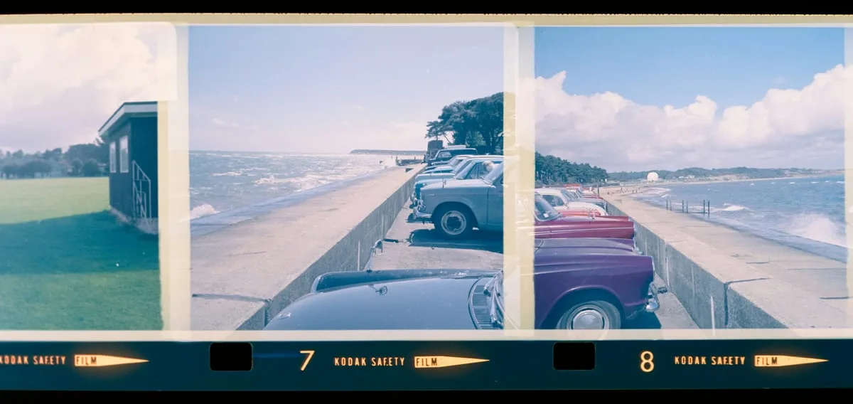
Kodak Portra 400
Amount 20, Size 25, Roughness 50
Warm skin tones, soft grain
Fujifilm Provia 100F
Amount 12, Size 20, Roughness 40
Vivid colors, fine grain
Kodak Tri-X 400 (B&W)
Amount 35, Size 35, Roughness 65
Coarse, classic B&W grain
Fujifilm Velvia 50
Amount 10, Size 18, Roughness 35
Extremely vivid, minimal grain
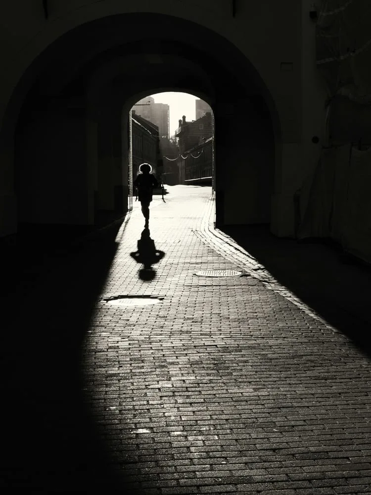
Halation
A red/orange glow at the edges of bright light areas. The signature look of Fujifilm and Kodak film stocks. Works especially well in backlit shots, street lights, or sunlit scenes.
Creating Halation in Lightroom
- 1
Masking → Luminance Range Selection
Masking panel → 'Luminance Range' → move the slider to the right (bright areas). Only highlights are selected.
- 2
Shift Color to Red/Orange
In Color Mix (HSL) or Color Grading, shift the selected area's color temperature by +30–50 (warmer), moving Hue toward red/orange.
- 3
Adjust Saturation and Strength
Too strong looks artificial. Recommended: Saturation +10–20, overall effect opacity 50–70%.
Quick Alternative — Lightroom Color Grading Highlights
Color Grading panel → rotate the Highlights wheel toward orange/red (+30–50°), Saturation 8–15. A quick way to achieve a halation look without masking.
Fade — Shadow Lift
Raise shadows to grey (10–30) instead of pure black (0) to create a faded, worn-film aesthetic. The simplest film effect — and the one that changes the overall mood the most.
Method 1 — Tone Curve Point Adjustment (Lightroom)
Develop Module → Tone Curve → drag the bottom-left point (shadow end) upward.
Bottom-left point → drag up 15–25
= Shadows lift from RGB(0,0,0) → approx. (25–40, 25–40, 25–40)
Method 2 — Raise the Blacks Slider (Quick Method)
Basic panel → raise the Blacks slider to +10–+25. Less precise than the tone curve, but useful for quick edits. Raising Shadows by +10–20 as well creates a softer fade.
Method 3 — Fade in Snapseed
Tools → 'Vintage' → adjust the 'Fade' slider to 20–40. Alternatively, go to 'Basic Adjustments' → lower the black point and add a light vignette.
Color Grading — Orange & Teal
The standard cinematic color formula. Orange in the highlights (skin, light), teal in the shadows (backgrounds, sky).
Lightroom Color Grading Panel Settings
Shadows
Dark areas shift to teal — skies and shadows become cinematic
Highlights
Bright areas warm up — skin and light pop more
Midtones
Subtle warmth in midtones — too much turns everything yellow
expand_moreLearn more — Other color grading styles
Beyond Orange & Teal, here are other popular grading styles.
Green & Magenta (Urban Street)
Shadows: Green 180°, Sat 10
Highlights: Magenta 300°, Sat 8
City / street / hip aesthetic
Blue & Orange (Golden Hour Landscape)
Shadows: Blue 220°, Sat 15
Highlights: Orange 40°, Sat 12
Sunsets and golden hour — more dramatic
Warm Fade (Vintage)
Shadows: Yellow 55°, Sat 8 + Lum +15
Highlights: Orange 35°, Sat 5
Faded, warm Polaroid look
Editing Recipes — Ready to Use
Enter these values directly in Lightroom. Since exposure varies by photo, adjust Exposure separately.
Kodak Portra 400 Simulation
Portraits · Weddings · EverydayWarm, soft skin tones with muted, natural colors
Fujifilm Velvia 50 Simulation
Landscapes · Nature · TravelHighly saturated, vivid colors with strong contrast
Kodak Tri-X 400 B&W
Street · DocumentaryClassic B&W with coarse grain and strong contrast
※ Values are based on Lightroom Classic and may need adjustment depending on your original exposure.
Recreate the Kodak Portra 400 Recipe
- →Open a portrait or everyday photo in Lightroom
- →Basic: Temp +150, Highlights -30, Shadows +25, Blacks +15
- →Color Mix: Orange Saturation +15
- →Effects: Grain Amount 20, Size 25, Roughness 50
- →Color Grading: add warm Hue 40, Sat 8 to Shadows
- →Compare before/after, then upload to AI for style analysis
More Content to Explore
Last updated: April 2026