Completing Your Photos
with Lightroom
Once you can read a histogram, editing transforms. Learn exposure to color — step by step.
Have you wondered?
"Lightroom costs money — do I really need it? How is it different from free apps?"
Lightroom's core strength isn't filters. The decisive difference is non-destructive RAW editing and masking (selective adjustments). Snapseed is free but has limited RAW editing and no layer structure, making revisions awkward. If the subscription is a concern — Lightroom Mobile's free tier still covers 80% of basic editing.
"Why does the same photo look completely different after editing? What's the principle?"
80% of a photo's mood is determined by just 3 sliders: Color Temperature, Tint, and HSL color shifts. A 'warm film look' means raising the color temperature and boosting orange saturation. A 'cool, refined look' means lowering color temperature and emphasizing blue/teal. Once you understand these patterns, you can edit any photo to the mood you want.
Histogram
A graph showing your exposure. Left = shadows, right = highlights. Gaps mean lost information.
Basic Panel
Exposure, Contrast, Highlights, Shadows, Whites, Blacks — 6 sliders to control the entire tonal range.
HSL / Color Mix
Hue, Saturation, Luminance — each color channel can be adjusted independently.
How to Read a Histogram
Before editing, check the histogram first. It tells you which direction to move the sliders — and by how much.
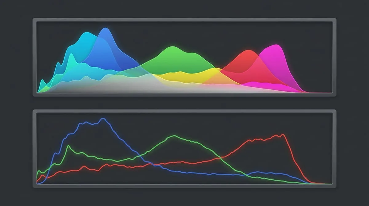
▲ Lightroom histogram panel — left: shadows, center: midtones, right: highlights
Graph touching the left wall — Shadow clipping
Shadow detail is completely lost (pure black). Raise Shadows and Blacks to recover detail.
→ Fix: Shadows +20~50, Blacks +10
Graph touching the right wall — Highlight clipping
Highlight detail is lost (pure white). Sky and white clothing detail have blown out.
→ Fix: Highlights -20~50, Whites -10
Single peak in the center — Balanced exposure
Generally a good exposure. If it looks too bright or dark overall, use the Exposure slider.
→ Fix: Exposure ±0.3~1.0 adjustment
U-shaped graph split to both sides — High contrast
Many bright and dark areas at once. Often seen in backlit scenes.
→ Fix: Highlights -40, Shadows +40 to balance
expand_moreLearn more — ETTR (Expose to the Right)
ETTR (Expose to the Right) means shooting as bright as possible without clipping. Digital sensors store more data (bits) in brighter areas, so post-processing produces less noise.
- On the camera, watch the histogram and raise exposure until just before the right edge clips.
- For RAW files, lower Exposure by 1–2 stops in Lightroom to reach your desired brightness.
- JPEG images benefit less from this technique — RAW shooting is a prerequisite.
Basic Panel — 6 Sliders
Adjusting in this order improves most photos. Each slider works independently.
Adjusts the overall brightness up or down. Adjust this first, but quality degradation begins beyond ±1.
💡 Fine-tuning within ±0.5 is ideal. If you need a large change, review your in-camera exposure.
Makes bright areas brighter and dark areas darker to increase dimensionality.
💡 Too high removes detail. +20–40 looks natural.
Selectively adjusts bright areas. If the sky is blown out, move it negative.
💡 -40 to -60 is effective for recovering cloud and sky detail.
Selectively adjusts dark areas. Useful for revealing a face in a backlit scene.
💡 +30 to +50 brings out facial detail in backlit portraits.
Sets the brightest point (Whites) and darkest point (Blacks). Used to align the histogram's two ends.
💡 Hold Alt (Mac: Option) while adjusting Whites to see clipping.
▲ After adjusting all 6 basic sliders — Exposure, Contrast, Highlights, Shadows, Whites, Blacks
Color Correction — White Balance + HSL
Once exposure is locked in, define the color. Set the overall color temperature with White Balance, then fine-tune by color with HSL.
Step 1 — White Balance (Temp + Tint)
Moving Temp (Color Temperature) right makes the image warmer (orange); moving it left makes it cooler (blue). Tint controls the green–magenta axis. If you see a green cast under fluorescent light, push Tint in the plus direction.
Sunset / Golden Hour
Temp +200~400 / Tint 0~+10
Warm and dramatic
Clear sky landscape
Temp -100~-300 / Tint 0~-5
Cool and crisp
Portrait / Natural light
Temp 0~+100 / Tint 0
Natural skin tones
Food / Indoor
Temp +100~+200 / Tint +5~+10
Warm and appetizing
Step 2 — HSL Color Mix
Adjust the Hue, Saturation, and Luminance tabs individually. The ability to change specific colors independently makes this panel very powerful.
Skin tone correction. Moving Hue toward red gives a healthy look. Raising Luminance brightens skin.
Sky color adjustment. Use Hue to shift blue toward teal. Control saturation and brightness.
Leaves and plant color. Use Hue to shift from yellow-green to deeper green. Boost Saturation.
Red foods (strawberries, meat) or removing red tones from skin.
expand_moreLearn more — Color Grading panel
Lightroom Classic's Color Grading panel lets you apply different colors to shadows, midtones, and highlights separately. The popular cinematic 'Orange & Teal' look is built here.
- Orange & Teal formula: apply teal (Teal, ~180°) to Shadows and orange (Orange, ~40°) to Highlights, each at Saturation 10–20.
- Film fade: raising the shadow Luminance to +10–+20 lifts blacks to grey, creating a film-style fade effect.
- Blending & Balance: Blending at the bottom of Color Grading controls the transition width between colors; Balance shifts where midtones fall between shadows and highlights.
Creating Presets & Batch Applying
Save your edits as a preset and apply the same tone to your next photo in one click.
Edit one photo thoroughly
Complete one reference photo from histogram to color grading. These values become the preset's foundation.
Save as a preset
Develop Module → click + at the top of the Presets panel on the left → check what to include. Generally uncheck Exposure (it varies by photo).
Sync to multiple photos (batch apply)
Select the reference photo → Ctrl+A to select all → click 'Sync'. Or in Grid View, select photos and use 'Auto Sync'.
Export
File → Export. Quality by use: SNS 80–90%, print 100%, web display 60–70%. Recommended long edge: 1200–2400px.
Editing App Comparison
Which app should you use? It depends on your goals.
Lightroom Classic (PC)
Pros: Full features, local storage, catalog management, best-in-class RAW editing
Cons: Monthly subscription cost, requires a capable PC for large RAW files
The industry standard for professional post-processing and large-volume RAW management. Worth the investment if you regularly edit weddings, travel, or commercial photography.
Lightroom Mobile (Free+)
Pros: Most features available free, cloud sync, intuitive UI
Cons: Some advanced features limited (masking etc.), mobile processing speed
The free version is sufficient if you're learning Lightroom or shoot primarily on your phone. The same interface as the PC version makes upgrading natural later.
Capture One (PC)
Pros: Superior RAW color rendering vs. Lightroom, exceptional skin tones and fine detail
Cons: Steep learning curve, cost, smaller ecosystem than Lightroom
Preferred by professionals in commercial, beauty, and fashion where skin tone accuracy is critical. Lightroom is more efficient for hobbyists.
Edit One Photo in 3 Minutes
- →Open Lightroom (PC or mobile) and import one recent photo
- →Check the histogram → look for clipping
- →Start with Highlights -30, Shadows +30
- →Adjust Temp (Color Temperature) ±100 to set the mood you want
- →In HSL, set Orange Saturation +10 to improve skin tones or food color
- →Compare before/after with the \ shortcut, then upload to AI
More Content to Explore
Last updated: April 2026